
Matilda Jewellery — A Shopify Store Designed to Let the Jewellery Speak
A refined jewellery storefront rooted in Portuguese craft, small details, and intentional design.

Project Narrative
A Shopify Store Designed to Let the Jewellery Speak
01 — The Brand
MATILDA creates meaningful jewellery built around simplicity, intention, and everyday expression.
Born and handcrafted in Portugal, the brand focuses on jewellery with an understated aesthetic, produced largely through local craftsmanship. Its range spans earrings, necklaces, rings, bracelets, and anklets, alongside personalisation and bespoke gifting experiences.
The opportunity wasn't simply to make MATILDA look more premium — it was to make the digital experience feel as considered as the jewellery itself.
02 — The Challenge
The product had the story. The store was getting in the way.
The existing shopping experience suffered from critical friction points:
- 01 — Product pages felt generic
The presentation didn't give individual pieces enough space to communicate their character, details, and story. - 02 — Too much visual competition
Heavy layouts and unnecessary visual noise made it harder for the delicate jewellery imagery to take centre stage. - 03 — The buying journey lacked clarity
Information wasn't presented at the moments customers needed it, creating hesitation during consideration. - 04 — Checkout friction
Customers who had already decided to buy faced unnecessary barriers and steps at the final stage.
The core problem: MATILDA didn't need more noise. It needed a better environment for its products to sell.
03 — The Strategy
Less clutter. More intention.
Technostripe rebuilt the Shopify experience around one guiding principle: let the jewellery lead.
Instead of adding decorative elements to communicate value, we simplified the experience around what mattered most:
Product → Story → Confidence → Purchase
This meant rethinking how customers discovered pieces, how individual items were showcased, and how smoothly they moved from consideration to checkout.
04 — What We Changed
01. An Editorial Shopping Experience
We moved away from a dense, generic e-commerce grid to create a cleaner visual hierarchy where high-resolution product photography could do the storytelling.
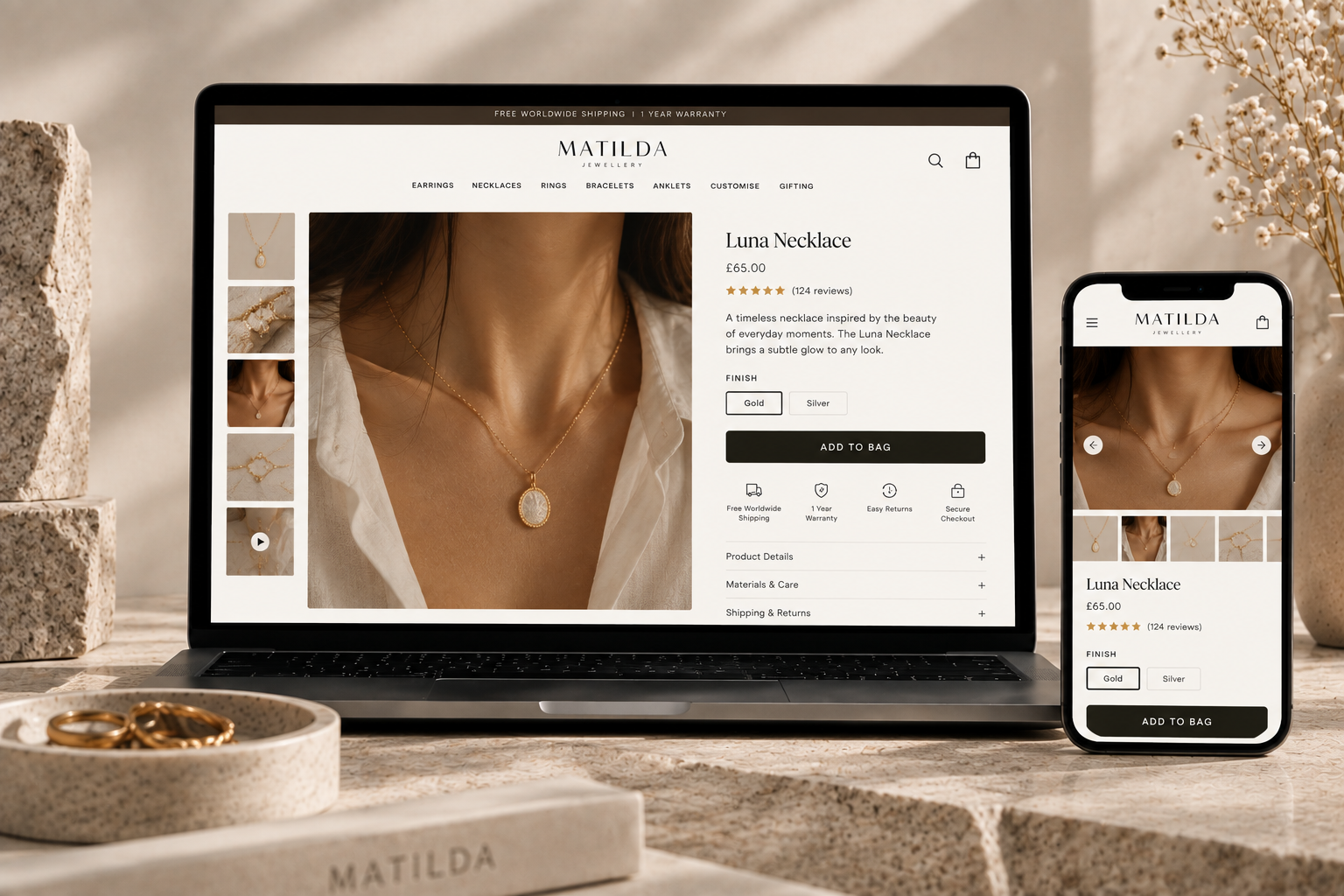
02. Product Pages Built Around Detail
Each piece received room to breathe. We reworked PDP layouts to highlight craftsmanship details, metal specifications, and styling inspiration without burying essential purchasing actions.
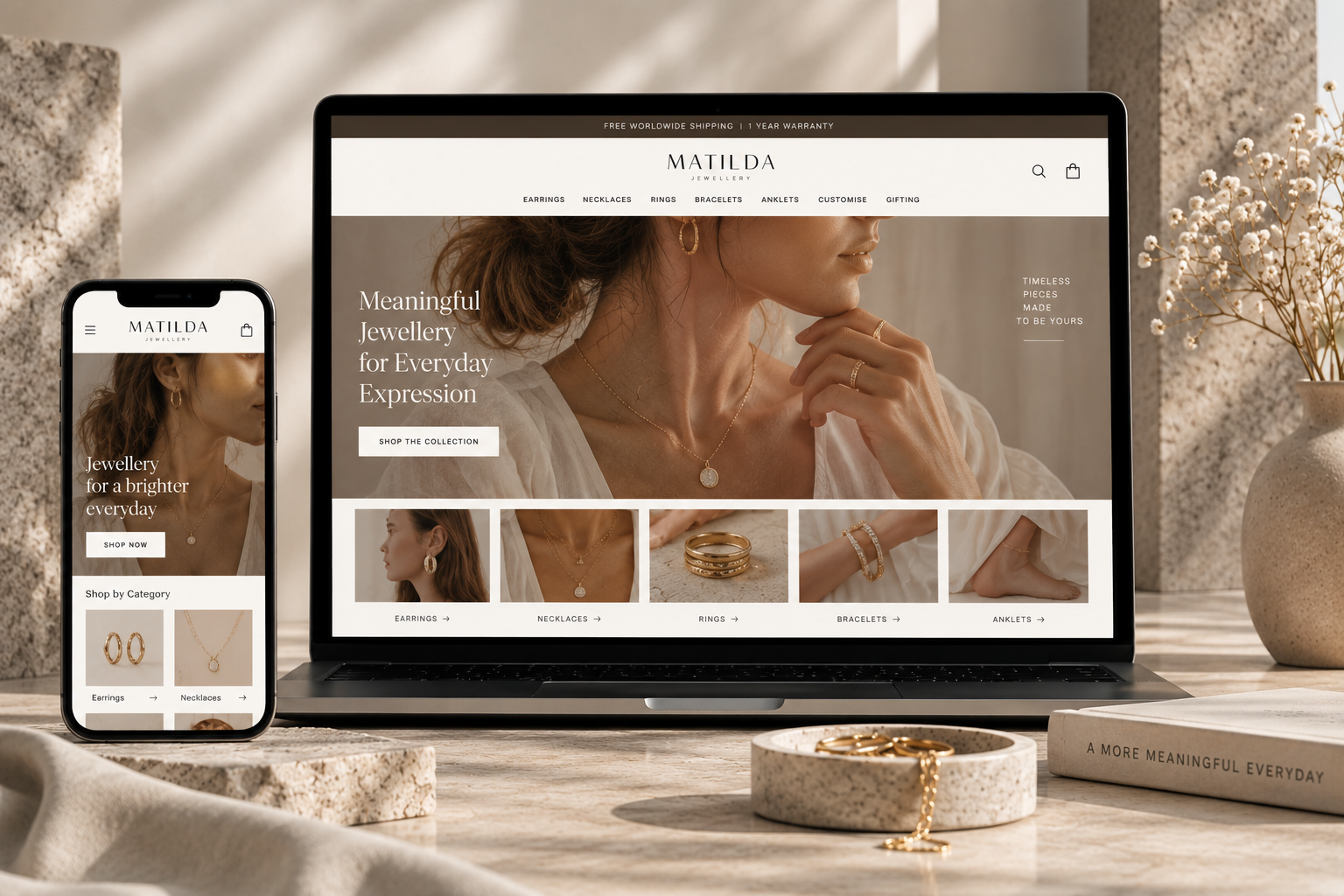
03. Intuitive Catalogue Discovery
With a broad catalogue spanning earrings, necklaces, rings, and curated gift edits, navigation was redesigned to help customers find the right piece effortlessly by style, occasion, or material.
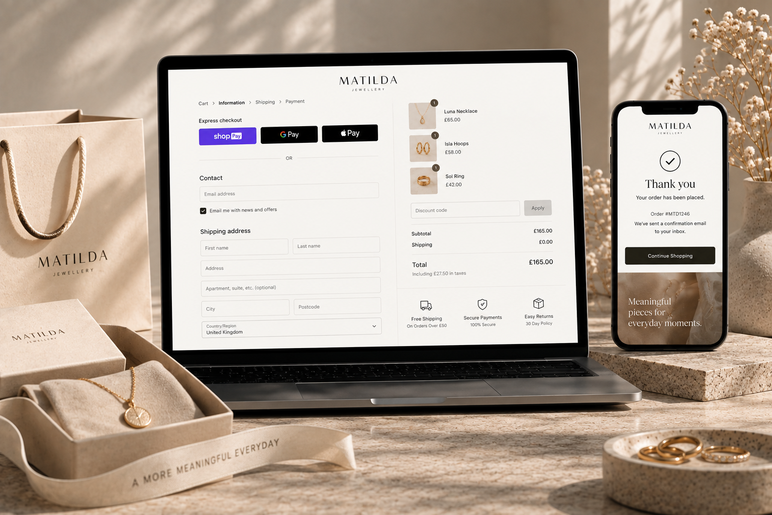
04. Seamless Express Checkout
We eliminated final-step friction by introducing 1-click Express Checkout, clear shipping timelines, and transparent return policies right alongside purchase buttons.
05 — The Transformation
From a cluttered catalogue to an intentional, product-led brand experience.
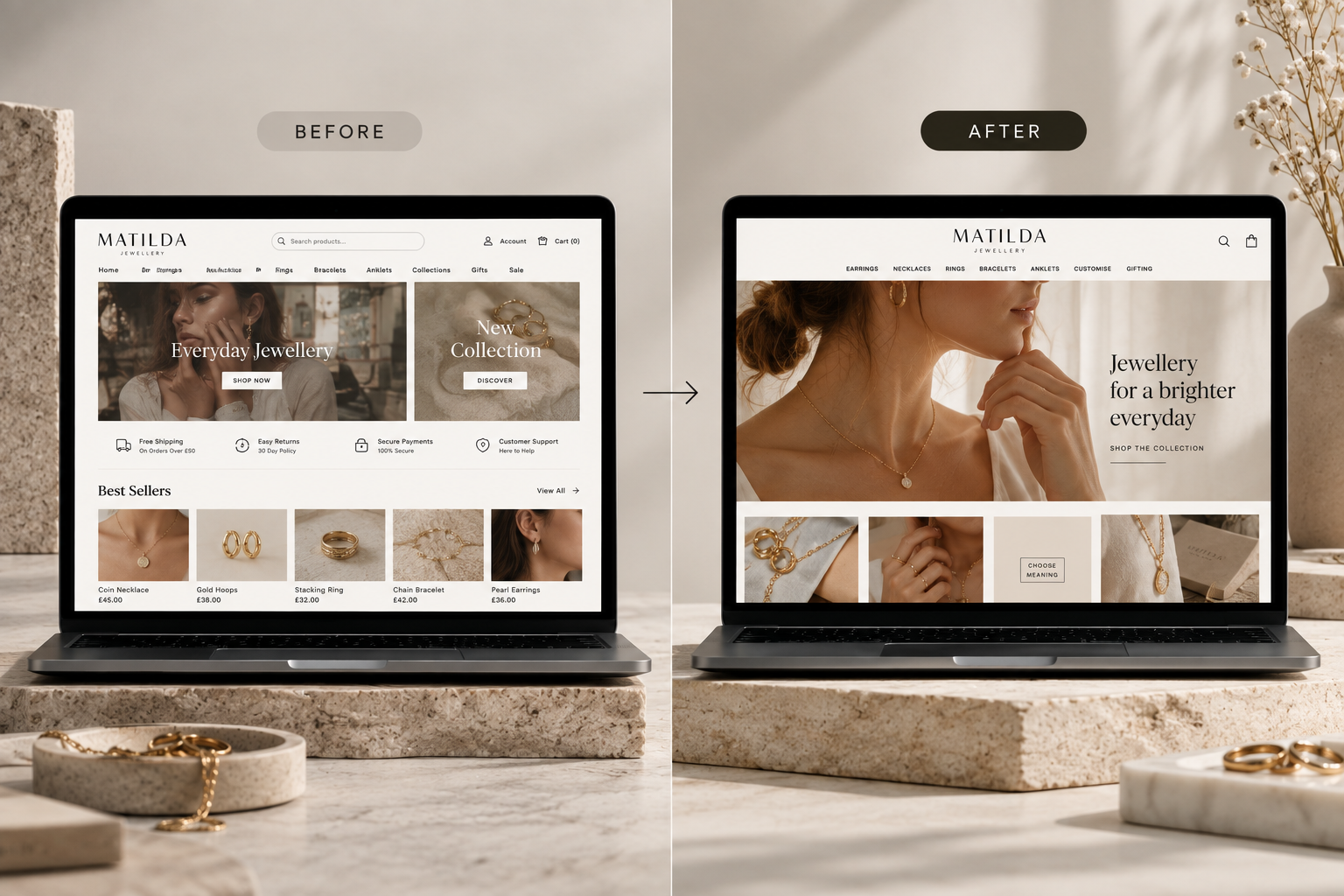
Before: Distracting & Overwhelming
- Cluttered grids with heavy borders
- Weak product storytelling and cramped imagery
- Complex navigation confusing first-time visitors
- Hesitation and checkout abandonment
After: Editorial & High-Converting
- Generous whitespace and intentional editorial layout
- Immersive product imagery with tactile material details
- Effortless category filtering and gifting guides
- Streamlined 1-click checkout flow
06 — Designed for Conversion
A premium Shopify store shouldn't just look better — it should make buying effortless.
Every design and structural decision served a specific conversion purpose:
- Better presentation → Stronger perceived value
- Better hierarchy → Quicker decision-making
- Better discovery → Higher average order value
- Lower friction → Smoother path to checkout
07 — The Outcome
A digital flagship that finally matches the artistry of the brand.
MATILDA transitioned from a site that distracted shoppers to an elevated shopping sanctuary:
- Elevated Brand Perception through curated editorial presentation
- Higher Engagement across collection browsing and gifting categories
- Smoother Checkout Completion via integrated express payments
- Frictionless Mobile Shopping optimized for touch and discovery
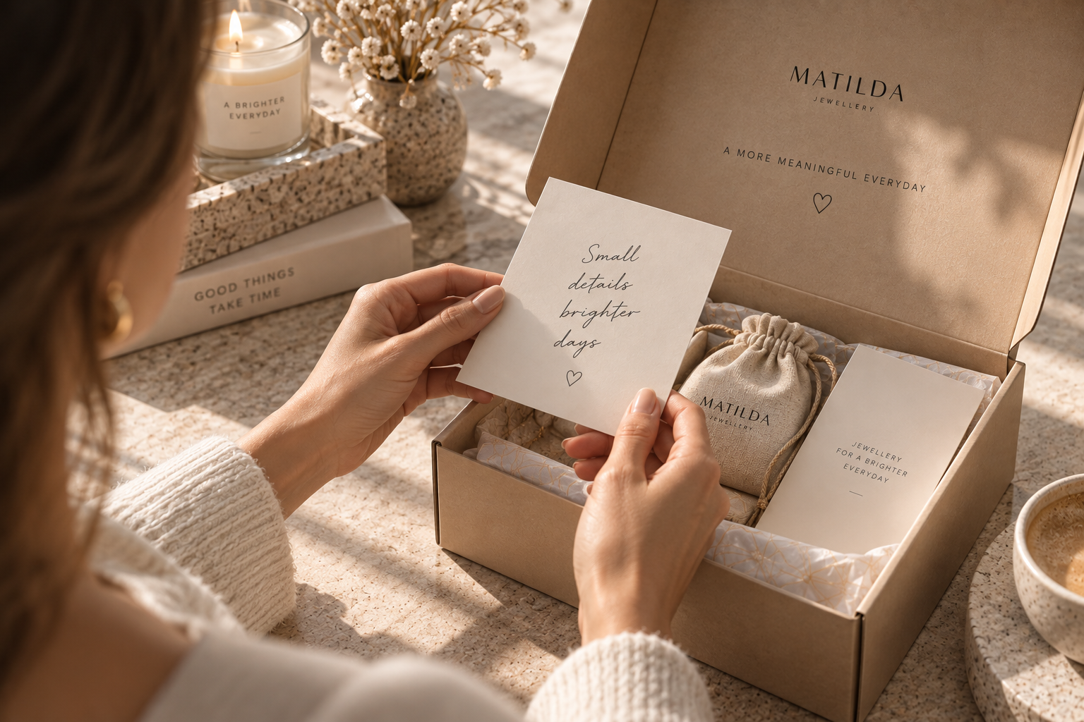
08 — The Technostripe Difference
MATILDA already had the craftsmanship. Our job was to ensure the digital experience never got in its way.
Technostripe delivered a custom Shopify storefront combining bespoke editorial UX with conversion rate optimisation, giving MATILDA the foundation to scale internationally.
Technostripe Solution — Shopify design, custom theme development, and UX conversion optimization for high-end boutique brands.
Project Specifications & Tech Stack
Live Project
Visit WebsiteKey Performance Metrics & Results
Origin
Portugal
Category
Fine Jewellery
Focus
Editorial UX
Checkout
Express 1-Click
Ready for similar growth?
Let's engineer your brand's next milestone
Book a free strategy audit with our senior e-commerce architects.
Book Strategy CallMore Projects
View All →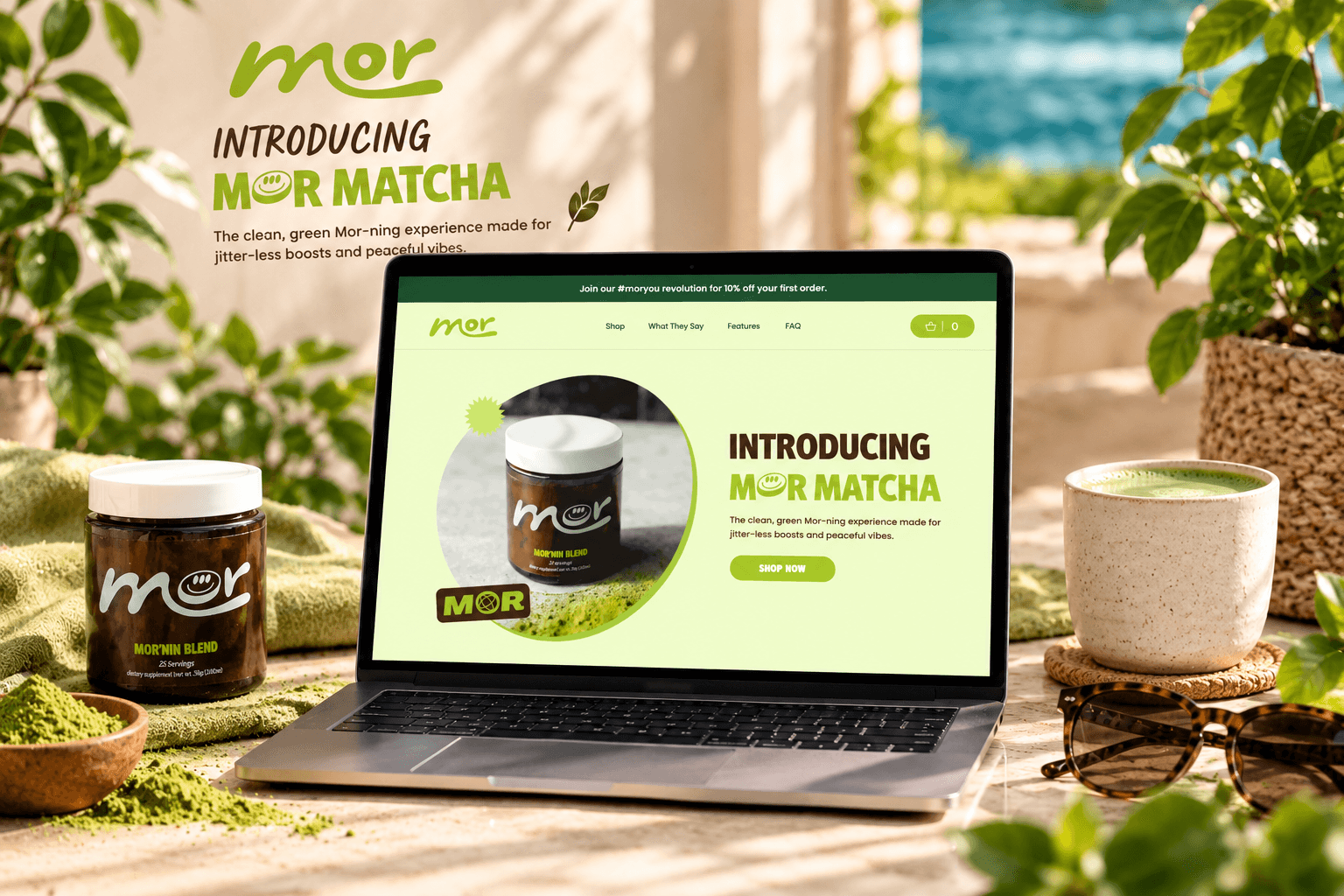

Mor Matcha
Stopping the Slow Bleed at Checkout
A focused storefront for clean matcha energy, with product education and a direct path to the Mor'nin Blend.
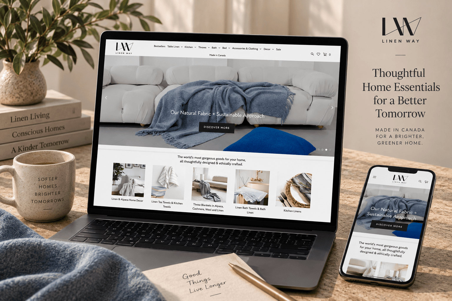
Linen Way
Surviving the Biggest Day of the Year
A warm, editorial shopping experience for sustainable linen, wool, and alpaca textures.