
Mor Matcha — Stopping the Slow Bleed at Checkout
A focused storefront for clean matcha energy, with product education and a direct path to the Mor'nin Blend.
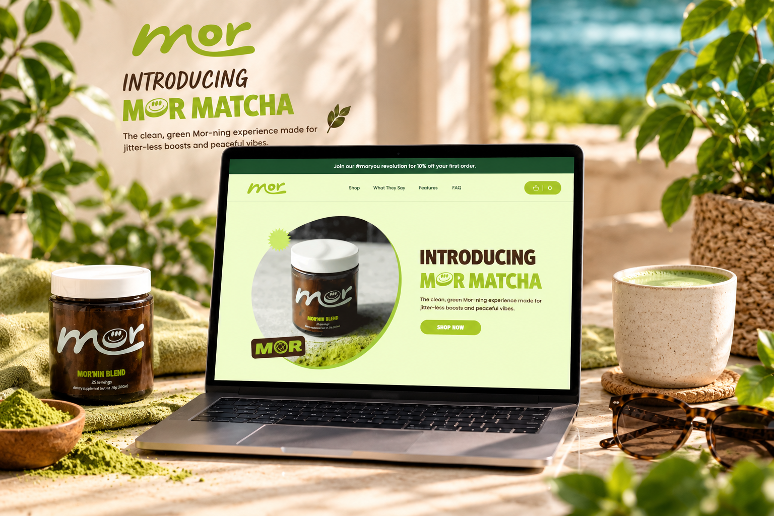
Project Narrative
Stopping the Slow Bleed at Checkout
01 — The Brand
MOR Matcha is a premium matcha brand built around making ceremonial-grade matcha part of an everyday ritual.
The brand already had many of the ingredients needed for a strong D2C business:
- Premium positioning
- Clean product presentation
- Strong photography
- A steady stream of engaged visitors
The problem wasn't getting people interested. It was getting them across the finish line.
02 — The Challenge
The product was converting attention. The checkout was losing customers.
More than seven out of every ten customers who added a product to their cart were leaving before completing their purchase.
That meant the hardest part was already happening:
- Customers were discovering the product.
- They were interested enough to add it to their cart.
- They were ready to buy.
But somewhere between “Add to Cart” and “Order Confirmed,” too many of them were disappearing.
For a D2C brand, that's more than a UX issue. It's revenue that has already been earned in the customer's mind — but never reaches the business.
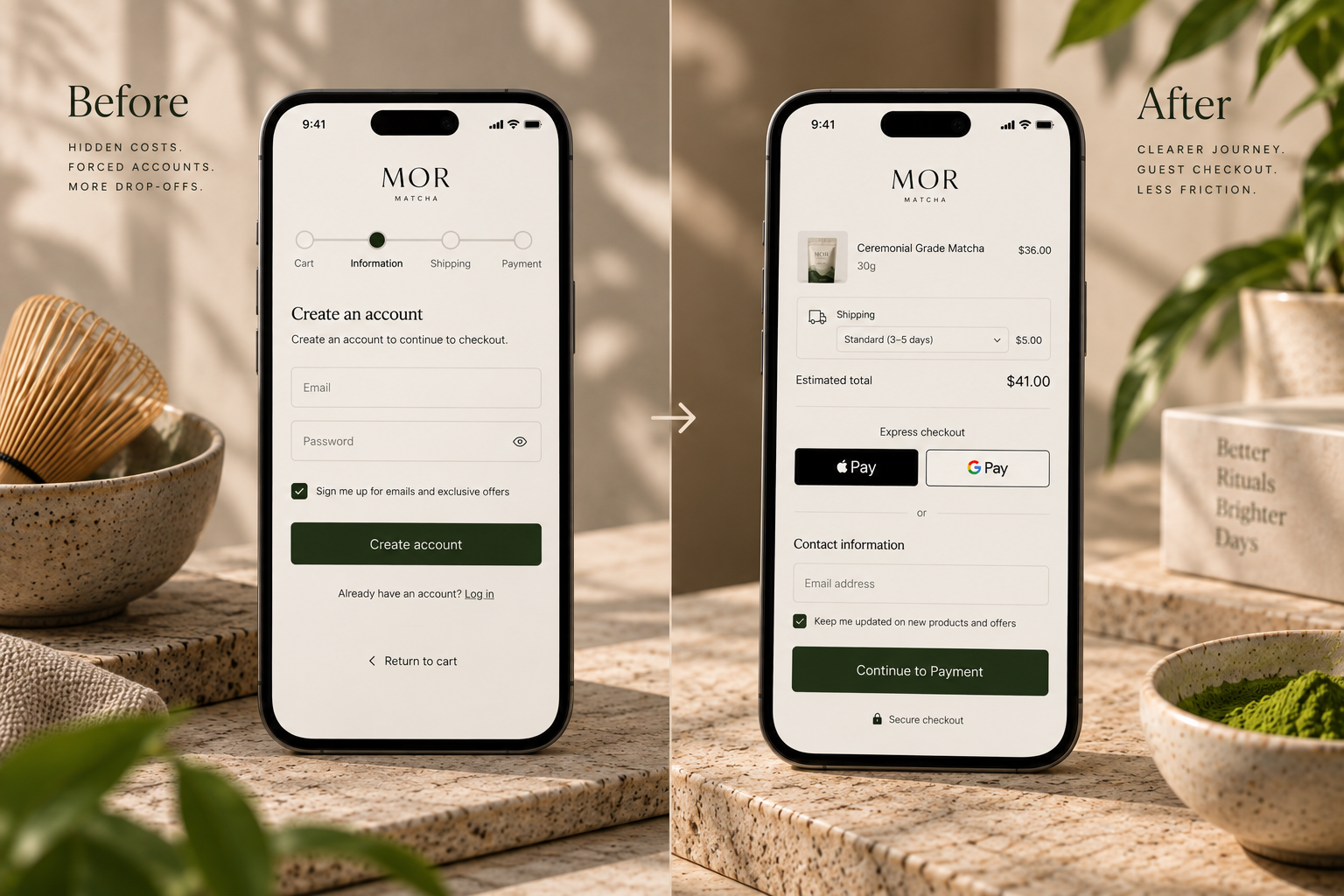
03 — The Diagnosis
The problem wasn't demand. It was friction.
We looked at the checkout experience to understand why customers who had already decided to buy were still abandoning their carts. Three critical issues stood out:
- Unexpected Shipping Costs
Shipping information appeared too late in the journey, creating an unwelcome surprise at the final point of purchase. - Forced Account Creation
Customers were pushed towards creating an account instead of being able to complete their purchase immediately. - Too Many Steps on Mobile
With a large share of traffic coming from mobile devices, every additional interaction created another opportunity for hesitation and abandonment.
The checkout wasn't broken. It was simply asking too much from a customer who had already said yes.
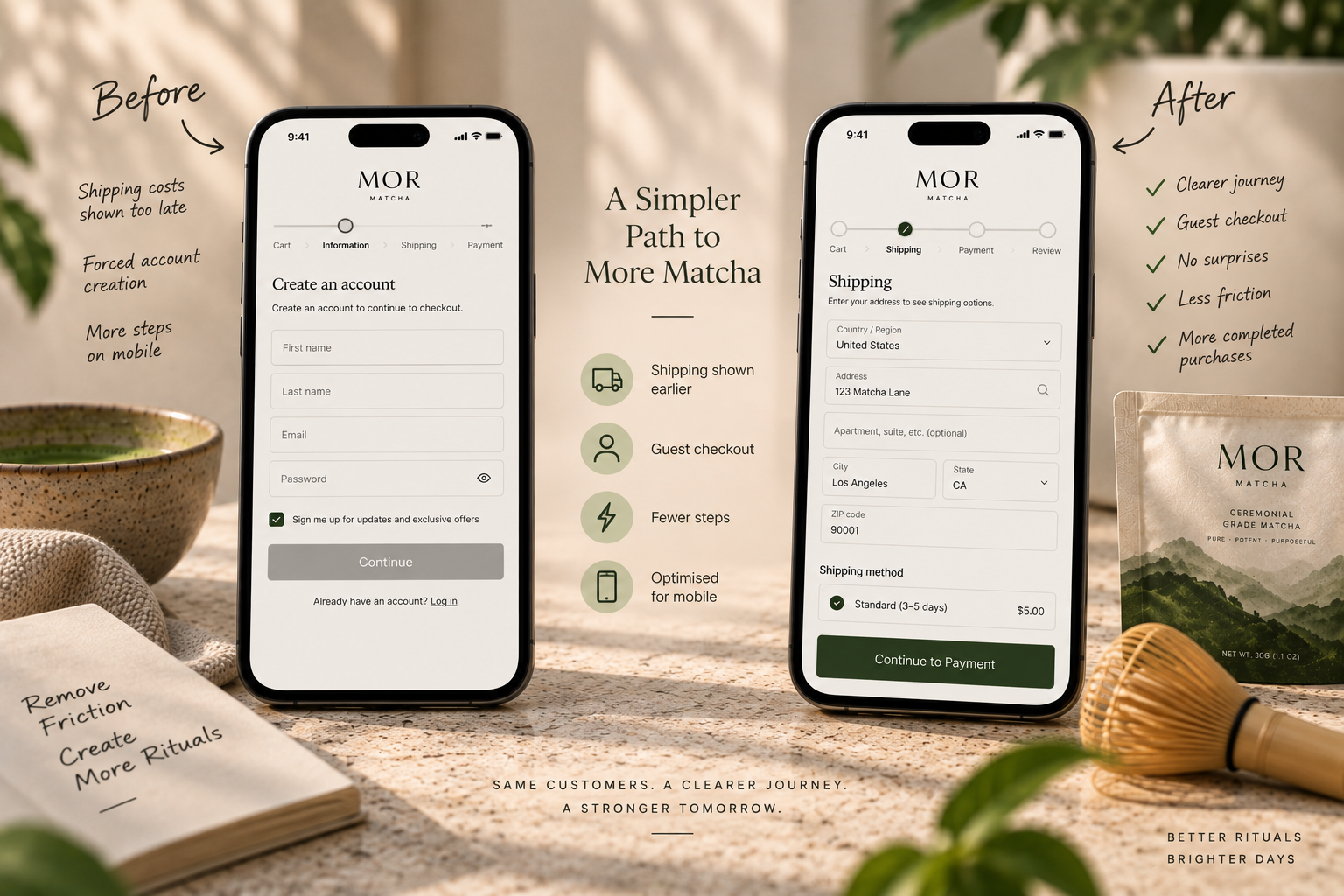
04 — The Strategy
Make the path to purchase feel effortless.
The objective wasn't to redesign the entire brand. It was much more focused: remove every unnecessary reason for a ready-to-buy customer to stop.
We rebuilt the checkout experience around four core principles:
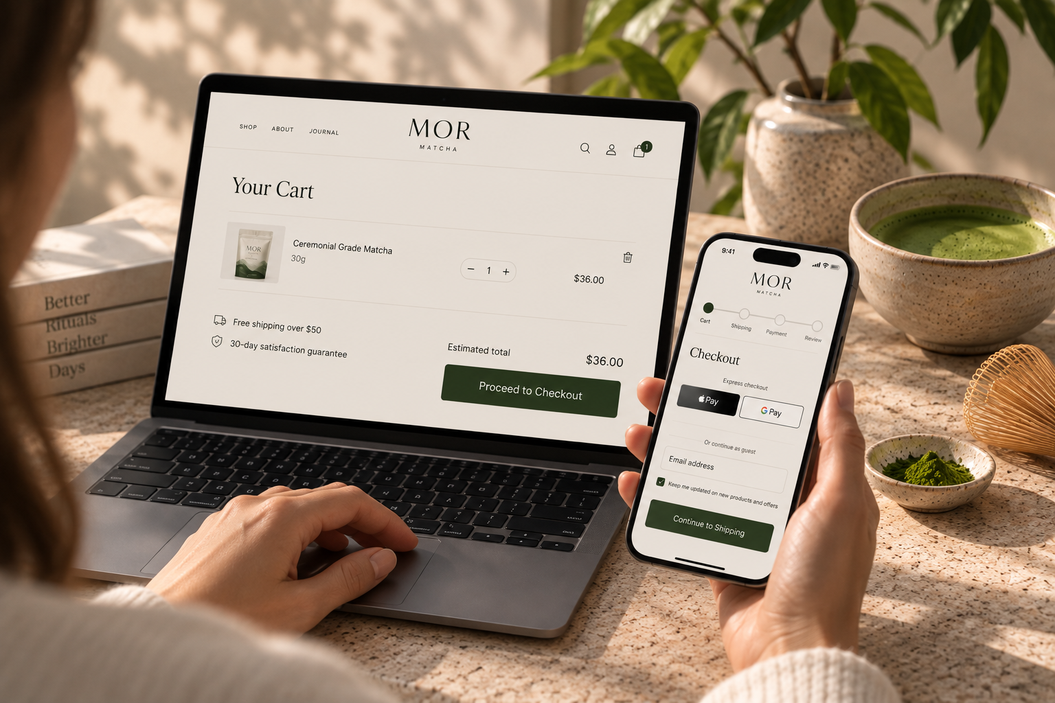
- Transparency → Show important costs earlier
- Simplicity → Remove unnecessary form fields and steps
- Flexibility → Let customers purchase without creating an account
- Mobile-First → Make the experience effortless on smaller screens
The goal was simple:
Cart→Checkout→Purchasewith as little friction in between as possible.
05 — What We Changed
01. Earlier Shipping Transparency
Shipping costs were moved earlier in the purchase journey so customers could understand the real cost before reaching the final step.
No last-minute surprises.
02. Guest Checkout
We removed the unnecessary account-creation barrier and allowed customers to complete their purchase without committing to an account.
Buy first. Account later.
03. A Shorter Checkout Journey
The checkout flow was simplified to reduce unnecessary interactions and make the path from cart to confirmation more direct.
Every step had to earn its place.
04. Mobile-First Optimisation
The checkout was refined with mobile behaviour in mind — reducing taps, improving clarity, and making key information easier to understand on a smaller screen.
Because when most of your traffic is on mobile, checkout friction becomes conversion friction.
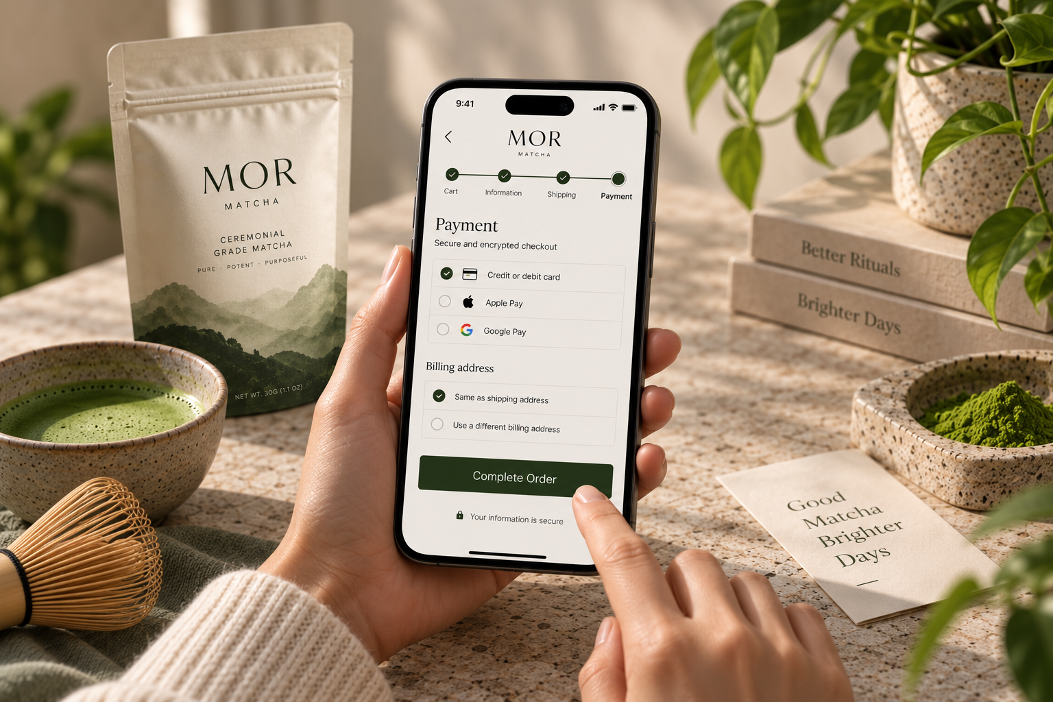
06 — The Transformation
This wasn't a dramatic visual redesign. And that was the point.
The product didn't change. The branding didn't change. The traffic didn't need to change. The experience between intention and purchase changed.
The new journey gave customers:
More clarity → Less hesitation → Fewer steps → Easier purchase
Key Visual & UX Improvements:
- Redesigned checkout experience
- Real-time shipping-cost transparency
- 1-click guest checkout integration
- Streamlined mobile checkout journey
- Unified Cart → Checkout → Confirmation flow
07 — Designed for Conversion
Good checkout design should almost disappear.
The best checkout experience isn't the one customers notice. It's the one they move through without thinking about it.
For MOR Matcha, the work wasn't about adding more features or creating more visual complexity. It was about removing the obstacles standing between wanting the product and buying the product.
08 — The Outcome
The slow bleed started to close.
By removing unnecessary friction from the final stage of the customer journey, MOR Matcha had a checkout experience designed to better support the demand it was already generating.
The biggest change wasn't cosmetic. Customers who had already decided they wanted the product were finally given a simpler, frictionless path to purchase.
09 — The Technostripe Difference
MOR Matcha didn't need more traffic. It needed to stop losing the customers it had already won.
Technostripe identified the friction, rebuilt the Shopify checkout experience, and turned a critical conversion leak into a smoother path from cart to customer.
Technostripe Solution — Shopify development and conversion optimisation for D2C brands that want their traffic to actually convert.
Project Specifications & Tech Stack
Live Project
Visit WebsiteKey Performance Metrics & Results
Category
Matcha Ritual
Platform
Shopify D2C
Focus
Checkout CRO
Flow
1-Click Guest
Ready for similar growth?
Let's engineer your brand's next milestone
Book a free strategy audit with our senior e-commerce architects.
Book Strategy CallMore Projects
View All →

Linen Way
Surviving the Biggest Day of the Year
A warm, editorial shopping experience for sustainable linen, wool, and alpaca textures.
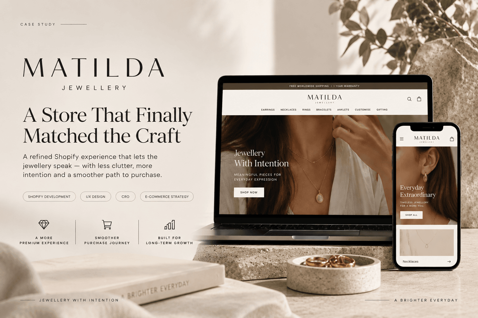
Matilda Jewellery
A Shopify Store Designed to Let the Jewellery Speak
A refined jewellery storefront rooted in Portuguese craft, small details, and intentional design.