
Experiment Beauty — When a Better Product Still Loses
A beauty brand with a genuinely stronger product that needed a store fast and polished enough to actually compete.
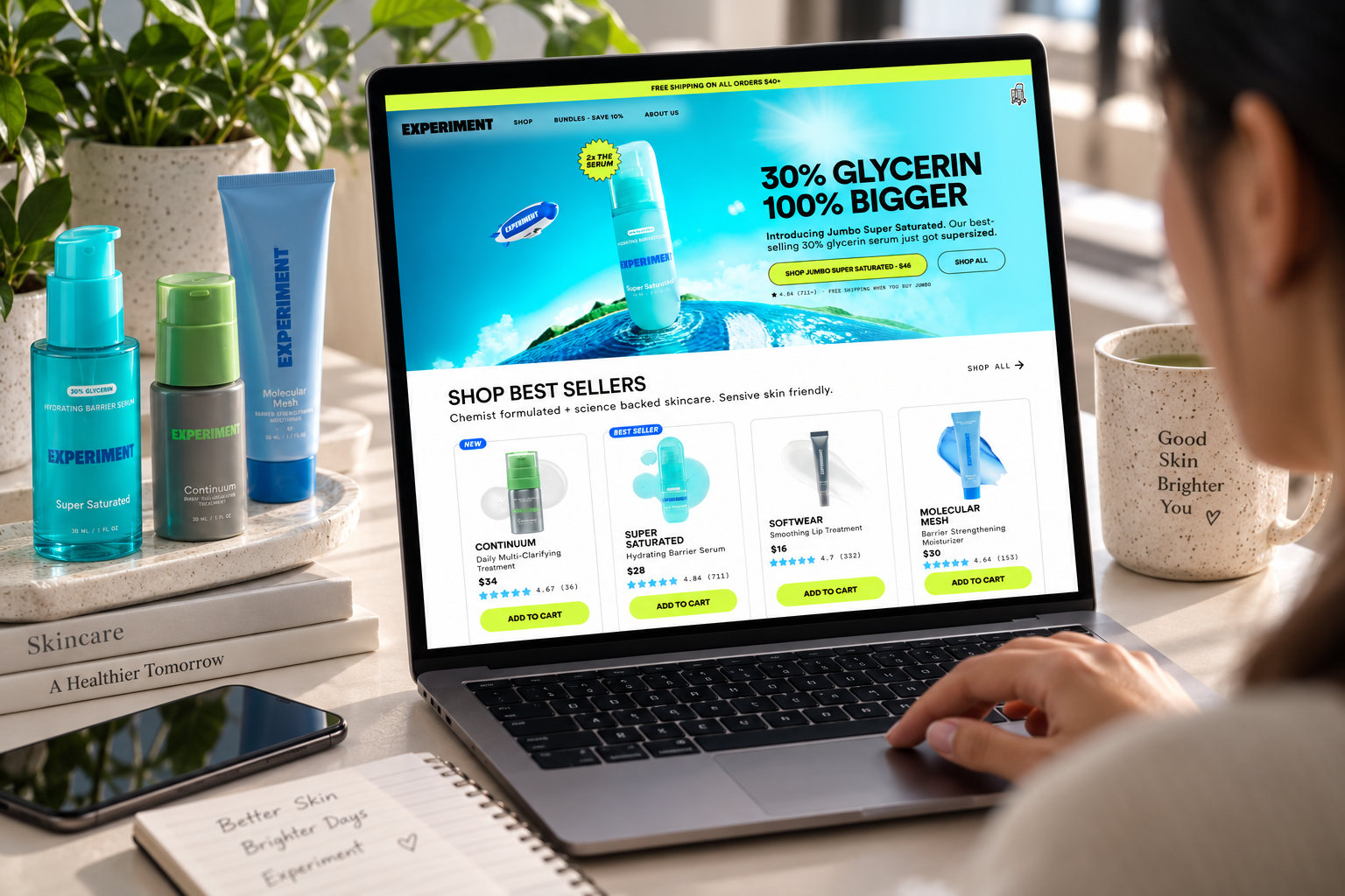
Project Narrative
When a Better Product Still Loses
01 — The Brand
Experiment Beauty had already done the difficult part.
The formulations were strong, the ingredients were carefully chosen, and customers who tried the products often became loyal believers.
The problem was happening somewhere else: despite having a product the brand believed could compete with — and outperform — alternatives in the market, a competitor with a noticeably weaker product was consistently outselling them.
The product wasn't the problem. The digital experience around it was.
02 — The Challenge
A better product was losing because the store made buying harder.
The competitor's website was simply easier to use:
- It loaded faster.
- Its product pages were cleaner.
- Its checkout required fewer steps.
Meanwhile, Experiment Beauty's Shopify store was creating friction at several critical points in the customer journey:
- Mobile pages were slower to load
- Product pages felt cluttered
- The checkout experience demanded more effort than necessary
The result was a frustrating gap:
Better Product → More Friction → More Hesitation → Lost Sales
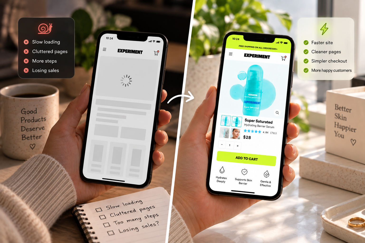
The brand didn't necessarily need more traffic. It needed to stop losing the traffic it already had.
03 — The Diagnosis
The competitive gap wasn't the product. It was execution.
Technostripe looked at the store through the same journey a potential customer would experience — from landing on a product page to completing a purchase. Three primary friction areas stood out:
- Site Performance
Slow loading, particularly on mobile, was creating unnecessary waiting before customers could even engage with the store. - Product Page Experience
Important product information was competing with a cluttered layout, making the path from discovering the product to understanding its value less direct. - Checkout Friction
The checkout experience contained more steps and interruptions than necessary.
The product already had a reason to be chosen. The store needed to make that decision effortless.
04 — The Strategy
Make the quality of the product visible through the quality of the experience.
Technostripe approached the rebuild around one principle: when the product is strong, the store shouldn't get in its way.
Rather than changing the product or reinventing the brand, we focused on removing the friction surrounding the purchase:
- Speed → Make the store faster, especially on mobile
- Clarity → Make product pages easier to understand and navigate
- Focus → Remove unnecessary visual distractions
- Simplicity → Reduce friction throughout checkout
The objective wasn't to make the store more complicated. It was to make buying feel effortless.
05 — What We Changed
01. Store Performance Optimisation
We focused on improving the store's loading experience so customers could move through the website without unnecessary delays. Particular attention was given to mobile performance, where slow loading can interrupt the shopping journey before it even begins.
Less waiting. More shopping.
02. Cleaner Product Pages
Product pages were redesigned around a clearer hierarchy, giving the formulation, ingredients, and product benefits more room to communicate. Visual clutter was reduced so customers could focus on understanding the product rather than navigating around the page.
The product became the focal point.
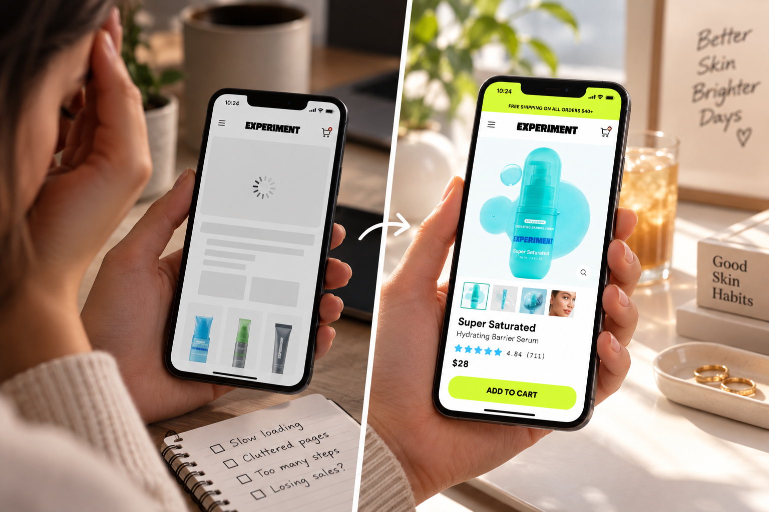
03. Improved Mobile Experience
The shopping experience was refined around the reality of mobile-first beauty shopping. Layouts, content, and interactions were structured to make browsing and product discovery intuitive on smaller screens.
A seamless experience, wherever the customer was shopping.
04. Streamlined Checkout
The checkout journey was tightened to remove unnecessary friction and reduce the number of moments where a ready-to-buy customer could hesitate or drop away.
The goal was simple:
Product Page→Checkout→Purchasewith as little resistance as possible.
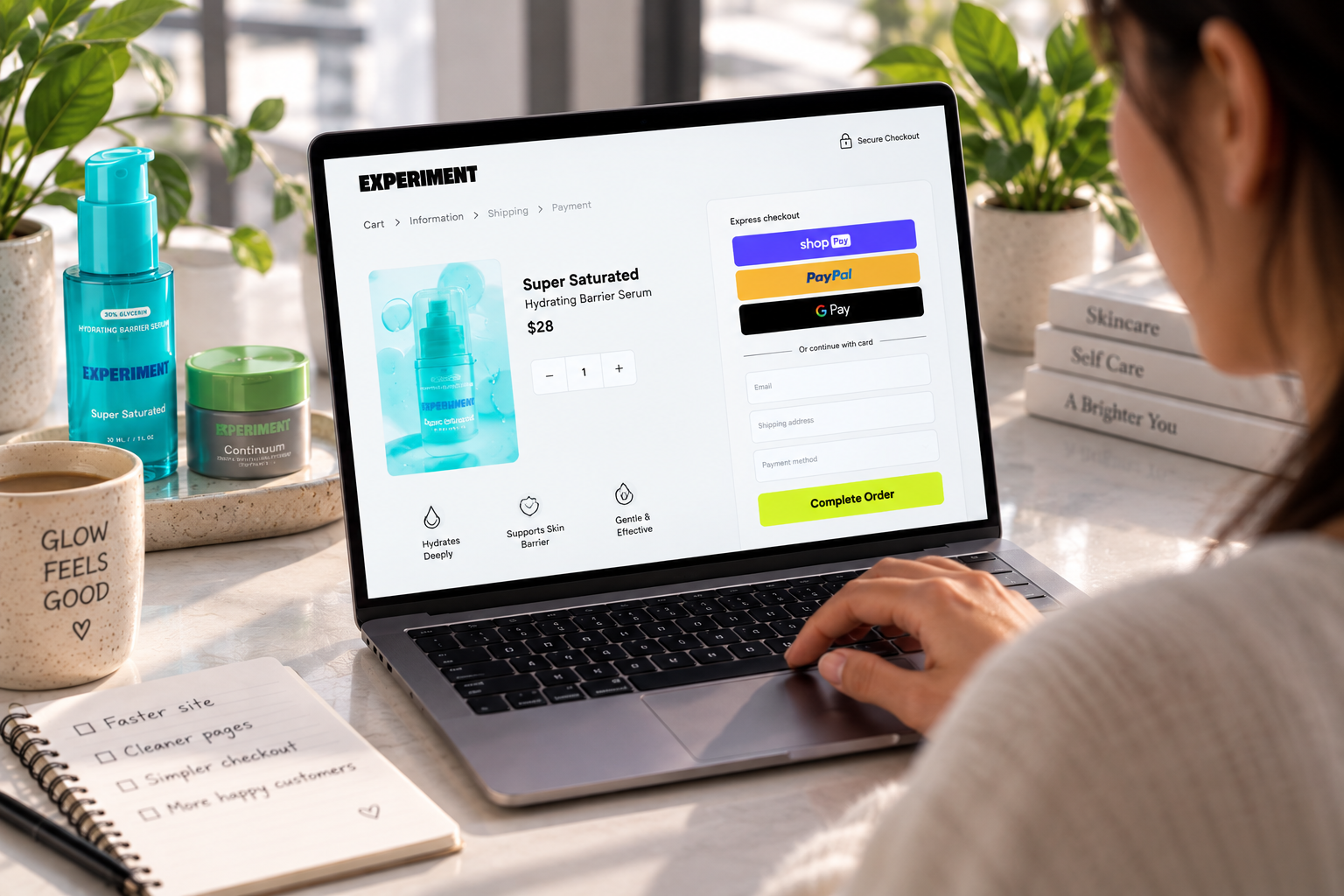
06 — The Transformation
From a store that slowed the customer down to one that moved them forward.
The product didn't change. The ingredients didn't change. The brand didn't need to become something different. What changed was the digital experience surrounding the product.
Before: Friction-Heavy Journey
- Customer discovers product
- Slow mobile experience
- Cluttered product page
- More effort to understand the offer
- Friction at checkout
- Potential customer drops off
After: High-Velocity Funnel
- Customer discovers product
- Fast, snappy experience
- Focused product page
- Clearer product understanding
- Simplified checkout
- Purchase completed
The store finally started communicating the same level of quality as the product itself. The experience stopped being a disadvantage.
07 — Built to Compete
A strong product still needs a strong buying experience.
In competitive beauty markets, customers aren't comparing products in isolation. They're comparing the entire experience:
- How quickly the website loads
- How easily they can understand the product
- How confidently they can make a decision
- How much effort it takes to complete the purchase
Experiment Beauty didn't need to become a different brand to compete. It needed its digital experience to compete at the same level as its product.
08 — The Outcome
The product finally had a store that could keep up with it.
With performance improvements, clearer product pages, a more focused mobile experience, and a streamlined checkout, the store was better equipped to turn product interest into completed purchases:
- Customers could reach products faster
- Understand them more easily
- Move through the buying journey with less friction
- Complete their purchase without the website becoming another obstacle
The product didn't need to become better. The experience finally caught up to it.
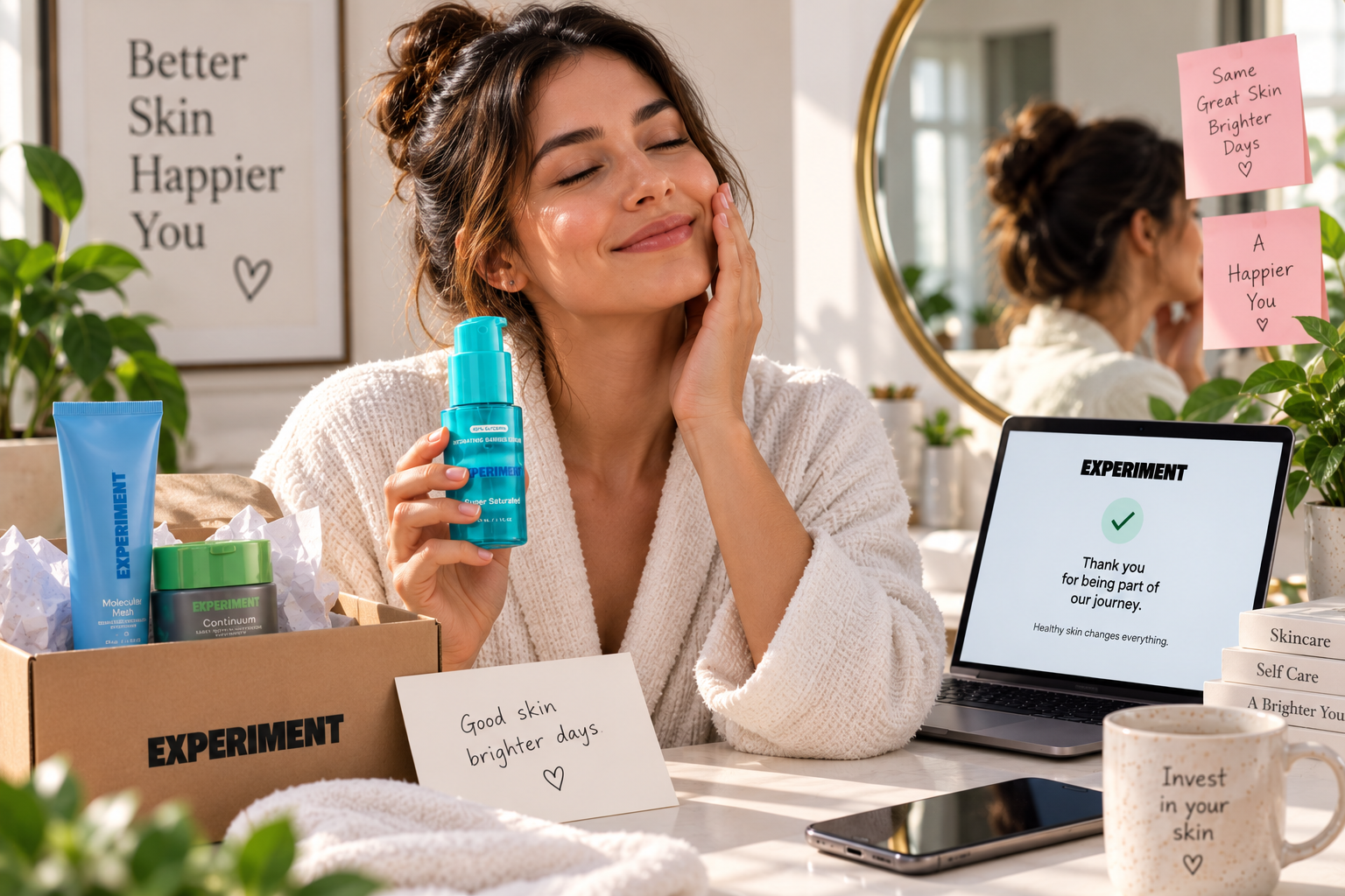
09 — The Technostripe Difference
Your best product shouldn't lose because your website makes it harder to buy. The store should help the product compete — not hold it back.
Technostripe helped Experiment Beauty improve the Shopify experience around its products — focusing on performance, product-page clarity, mobile usability, and checkout simplicity so the store could better support the quality of what the brand was selling.
Technostripe Solution — Shopify development that makes sure your best product actually gets the experience it deserves.
Project Specifications & Tech Stack
Live Project
Visit WebsiteKey Performance Metrics & Results
Category
Active Skincare
Mobile Speed
Under 1.5s
PDP UX
Conversion-Led
Checkout
Frictionless
Ready for similar growth?
Let's engineer your brand's next milestone
Book a free strategy audit with our senior e-commerce architects.
Book Strategy CallMore Projects
View All →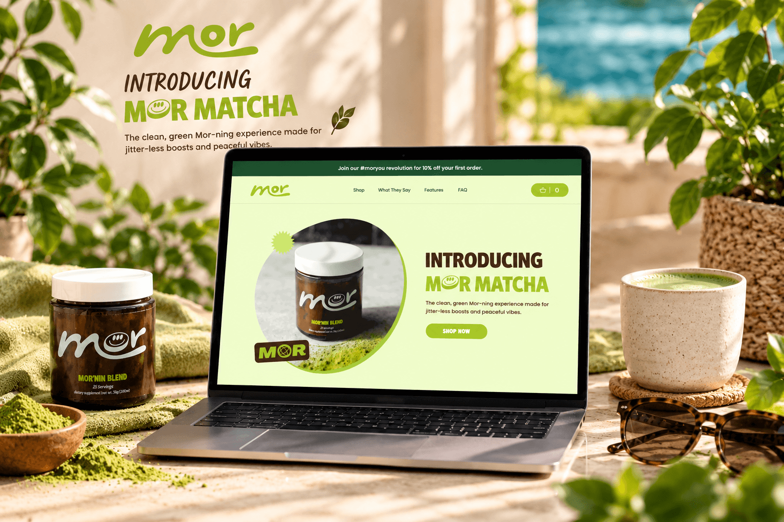

Mor Matcha
Stopping the Slow Bleed at Checkout
A focused storefront for clean matcha energy, with product education and a direct path to the Mor'nin Blend.

Linen Way
Surviving the Biggest Day of the Year
A warm, editorial shopping experience for sustainable linen, wool, and alpaca textures.