
TeesClub — Fixing the Gap Between the Click and the Page
A graphic tee brand whose ads were converting clicks perfectly — until a generic landing page and mismatched sizing quietly killed the sale.
Project Narrative
Fixing the Gap Between the Click and the Page
01 — The Brand
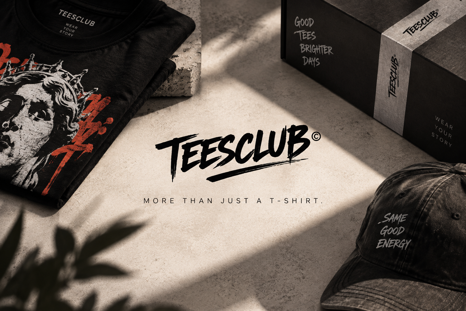
TeesClub is a men's graphic T-shirt brand built around bold designs, niche pop-culture references, and limited drops designed to sell fast.
The brand had already figured out something many e-commerce businesses struggle with: its advertising creative worked.
- The designs stopped people mid-scroll.
- The messaging created curiosity.
- And people were clicking.
But somewhere between that click and the purchase, something was breaking.
Traffic was arriving. Customers were looking. And then they were leaving.
The problem wasn't getting people to the store. It was what happened when they got there.
02 — The Challenge
The ads were winning the click, but the store was losing the customer.
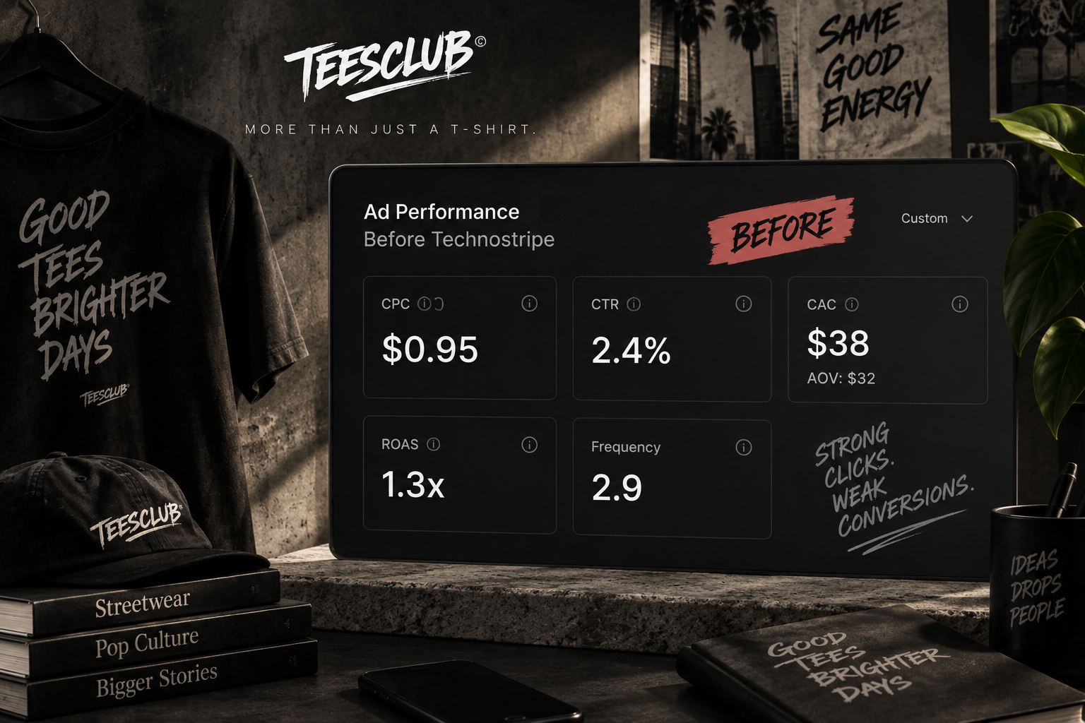
Before Technostripe stepped in, the advertising metrics actually looked strong:
- CPC — $0.95 Efficient traffic at a low cost.
- CTR — 2.4% Strong engagement for the category, confirming that the creative was doing its job.
- CAC — $38 Against a $32 average order value, meaning the economics were negative on nearly every first order.
- ROAS — 1.3x A surprisingly weak return considering how efficiently the ads were generating clicks.
- Frequency — 2.9 Still manageable, with no obvious sign of creative fatigue.
The account was producing inexpensive, highly engaged traffic. But that traffic wasn't translating into enough purchases.
03 — The Diagnosis
The click promised one thing. The landing page showed another.
We followed the customer journey beyond the ad. That's where the disconnect became obvious.
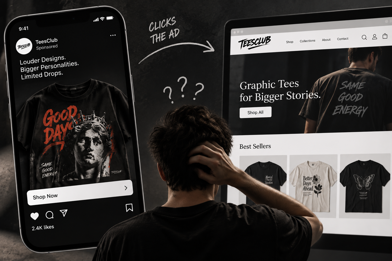
A customer would see an ad featuring a specific graphic T-shirt or limited drop. They clicked because that particular design caught their attention. But instead of landing on that product, they were sent to the generic Shopify homepage.
Now the customer had to:
- Click the ad
- Reach homepage
- Browse the catalog
- Find the product they originally wanted
- Decide whether to continue
The customer had already told us what they wanted when they clicked. The website was making them search for it again.
For a brand built around impulse, personality, and limited drops, that extra friction was enough to kill momentum.
There was another issue hiding inside the Shopify data: the sizing chart didn't accurately communicate TeesClub's relaxed, oversized fit. Customers were ordering their usual size, receiving a fit that felt different from what they expected, and returning products.
So there were actually two gaps:
- Ad → Landing Page
- Product → Customer Expectation
Both were costing the brand money.
04 — The Strategy
Make the journey feel like one continuous experience.
The strategy wasn't to change the ads. It was to make everything after the click match what the ads had already started.
The new journey became:
Specific Ad → Specific Product / Drop → Relevant Landing Experience → Clear Fit Information → Purchase
For limited releases, we went further. Dedicated drop pages carried the same urgency and energy that made the advertising compelling — including stock availability and countdown elements.
The objective was simple: If the ad creates the desire, the page should make acting on that desire effortless.
05 — What We Changed
01. Matched Ads to Products
Instead of sending every campaign to the homepage, each ad was connected directly to the specific product it featured. For collection-based campaigns, traffic was sent to the relevant drop or collection.
The customer no longer had to hunt for what they had already clicked on.
02. Built Drop-Specific Landing Pages
Limited releases received dedicated landing experiences designed around the way TeesClub actually sold:
- Stock counters to highlight real-time availability
- Drop countdowns to create genuine urgency
- Product-focused messaging to keep momentum alive
The urgency already present in the brand's identity was finally carried through to the website. The drop didn't end when the ad ended.
03. Rebuilt the Size Guide
The generic sizing chart was replaced with guidance that reflected the actual fit of each style. Customers could better understand the relaxed and oversized nature of the products before purchasing. Fit expectations became clearer before the order was placed.
04. Added Fit Comparison Information
We added fit-comparison notes directly onto product pages so customers could understand how each style compared with a more familiar fit.
This addressed one of the quietest sources of margin loss: customers buying their normal size and receiving something they didn't expect.
06 — The Transformation
From a disconnected click to a continuous buying journey.
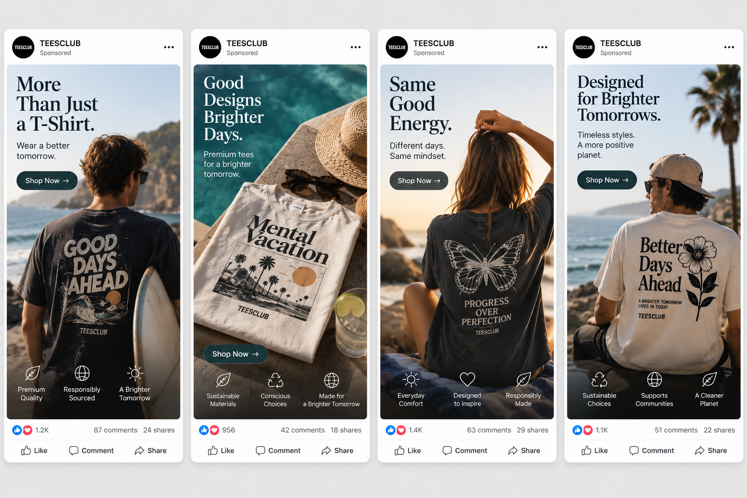
The biggest improvement came from removing the gap between what the customer saw in the ad and what they experienced after clicking.
Before: Fragmented and Leaky
- Specific graphic in ad
- Click
- Generic homepage
- Unrelated products
- Customer searches
- Interest fades
- Purchase lost
After: Seamless and High-Converting
- Specific graphic in ad
- Click
- Exact product / relevant drop
- Urgency + product context
- Clear fit expectations
- Purchase completed
The advertising didn't need to become louder. The website simply needed to continue the story the ad had already started.
07 — What Changed in the Numbers
The ads stayed strong. The funnel finally caught up.
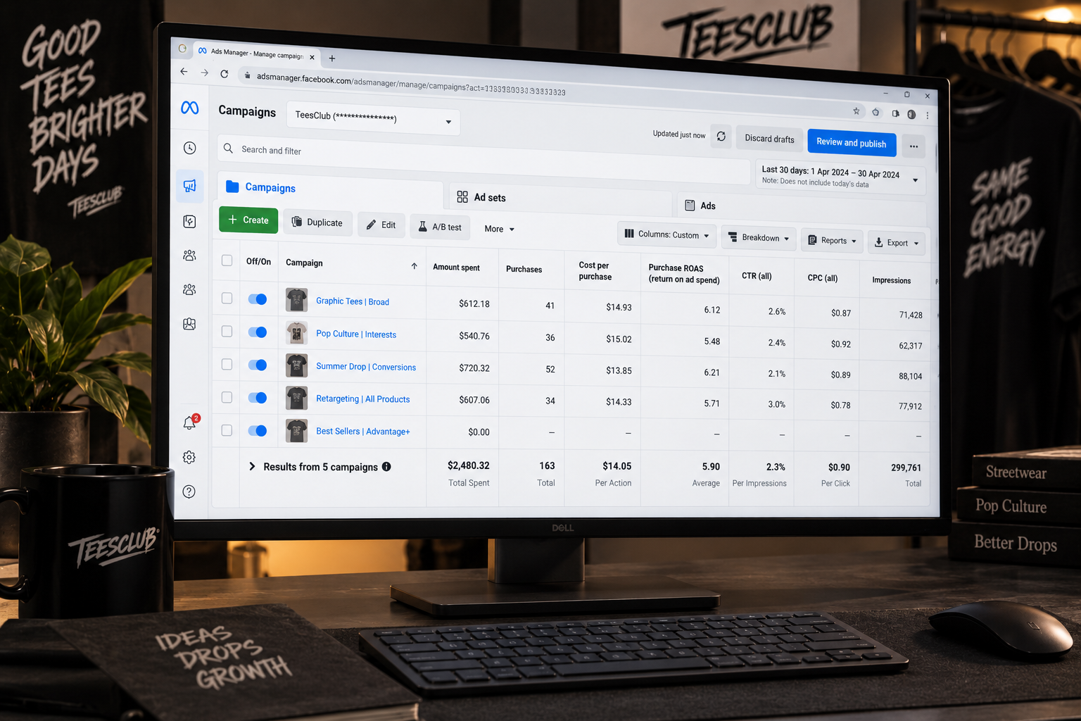
| Metric | Before | After | Impact |
|---|---|---|---|
| CPC | $0.95 | $0.90 | Maintained efficient acquisition |
| CTR | 2.4% | 2.3% | Strong creative engagement |
| CAC | $38 | $14 | 63% reduction in acquisition cost |
| ROAS | 1.3x | 5.9x | +353% increase in return on ad spend |
| Frequency | 2.9 | Under 3.0 | Healthy creative fatigue control |
- CPC remained almost unchanged, moving from $0.95 to $0.90.
- CTR stayed strong at 2.3%, confirming that the original creative wasn't the problem.
- The major shift happened further down the funnel:
- CAC dropped from $38 to $14.
- ROAS climbed from 1.3x to 5.9x.
- Frequency remained healthy at under 3.0, giving the account room to continue testing drop-specific creative without excessive repetition.
The traffic hadn't fundamentally changed. The experience receiving that traffic had.
08 — The Outcome
The website finally finished the sentence the ads started.
TeesClub already had the hardest part figured out:
- People wanted to click.
- The creative created curiosity.
- The products created interest.
What was missing was a frictionless path from that interest to purchase.
By connecting each ad to the product or drop it actually featured, building dedicated experiences for limited releases, and clarifying product fit, the entire journey became more intentional:
- The ad created the desire.
- The landing page carried it forward.
- The product page removed the hesitation.
And the result was a much more efficient path from click to customer. Great ads had been doing their job the whole time — the site just wasn't finishing the sentence they started.
09 — The Technostripe Difference
A great ad earns the click. A great store knows what to do with it.
Technostripe connected TeesClub's advertising with its Shopify experience — matching ads to the right products, creating drop-specific landing experiences, and removing the fit-related friction that was hurting conversions and margins.
Technostripe Solution — Paid ads and Shopify development working as one system, not two separate line items.
Key Performance Metrics & Results
ROAS
5.9x
from 1.3x
CAC
$14
from $38
CTR
2.3% (steady)
CPC
$0.90 (steady)
Ready for similar growth?
Let's engineer your brand's next milestone
Book a free strategy audit with our senior e-commerce architects.
Book Strategy CallMore Projects
View All →

Mor Matcha
Stopping the Slow Bleed at Checkout
A focused storefront for clean matcha energy, with product education and a direct path to the Mor'nin Blend.
Linen Way
Surviving the Biggest Day of the Year
A warm, editorial shopping experience for sustainable linen, wool, and alpaca textures.